Seymourpowell CEO Adrian Caroen takes us behind the scenes of a two year renovation project involving the iconic British drinks brand Ribena
The FMCG sector is notoriously competitive, with an increasing squeeze on consumers’ attention spans making it harder to gain cut-through than ever before. Driving “shelf appeal” through bold packaging is a tried and tested way to attract consumers, and a packaging refresh is often the first thing tabled by marketers hoping to boost the bottom line.
Explore packaging in isolation however, and you’re unlikely to get the results you want. After all, consumers don’t experience packaging on its own – they experience the product as a whole.
A recent project we undertook for Ribena exemplifies this: initial research for a refresh of the brand’s flagship Ready to Drink product revealed the need for a broader portfolio strategy, in order to truly meet changing consumer needs. Delivering on such a brief requires a broad range of insights and expertise, from industrial designers to brand strategists, something we pride ourselves at Seymourpowell on housing under a single roof. So, how did we do it?
The Brief
Two years ago, Ribena approached us to execute a 2D graphic and structural redesign for its flagship Ready to Drink product, with the aim of boosting the product’s market appeal and improving the bottle’s recyclability. We then undertook a broader 2D label redesign for Ribena’s Core Squash, No Added Sugar, and Botanical Fruit Cordial product ranges. This series of projects resulted in the launch of a refreshed portfolio of products and re-introduced the British icon to audiences old and new.
Throughout, we worked closely with Ribena to establish how a brand and packaging renovation would help it to further cement its position in the market without losing any of the emotional resonance of the existing identity. The project also presented the opportunity to bolster Ribena’s sustainability credentials, building on the brand’s use of recycled plastic (PET) in its bottles for over 15 years and responding to growing consumer demand for marketing-led sustainable products.
Our Approach
As a business, we always employ a consumer-centric approach for all projects, big or small. It is important to fully understand the end-user, especially their motivations when choosing a particular product, as well as their specific needs from a brand relationship. This should be closely wedded to an understanding of the brand from a practical point of view, including supply chain and manufacturing considerations. It is only when these are combined, that a redesign can be truly successful. When we think about packaging, it is really important that we focus all of our attention on the product and its proposition, not just packaging in isolation. When making a purchase, consumers are most often led by the desire for the product, not the packaging – about how it makes them feel, what it means to them, and why they would (subconsciously) choose a brand over its nearest competitor.
With this in mind, our in-house foresight team began the process of conducting in-depth consumer research into the perception of Ribena amongst its existing and desired consumer base. Their findings revealed a need for modernisation within the brand’s product range, in order to drive greater consideration.
This research – which we refer to internally as “design anthropology” – is a combination of ethnographic research and interview techniques which reveal the latent needs and desires of the existing and projected consumer in their cultural setting. In other words, it helps us understand what the brand means to them, how they interact with the products, and how they behave with them in everyday life.

Our team also went behind the scenes of the Ribena operation itself, gaining a deeper understanding of how its supply chains and manufacturers function. Armed with this insight, both from a consumer and technical perspective, the team were well positioned to begin the design process for the new Ready To Drink product.
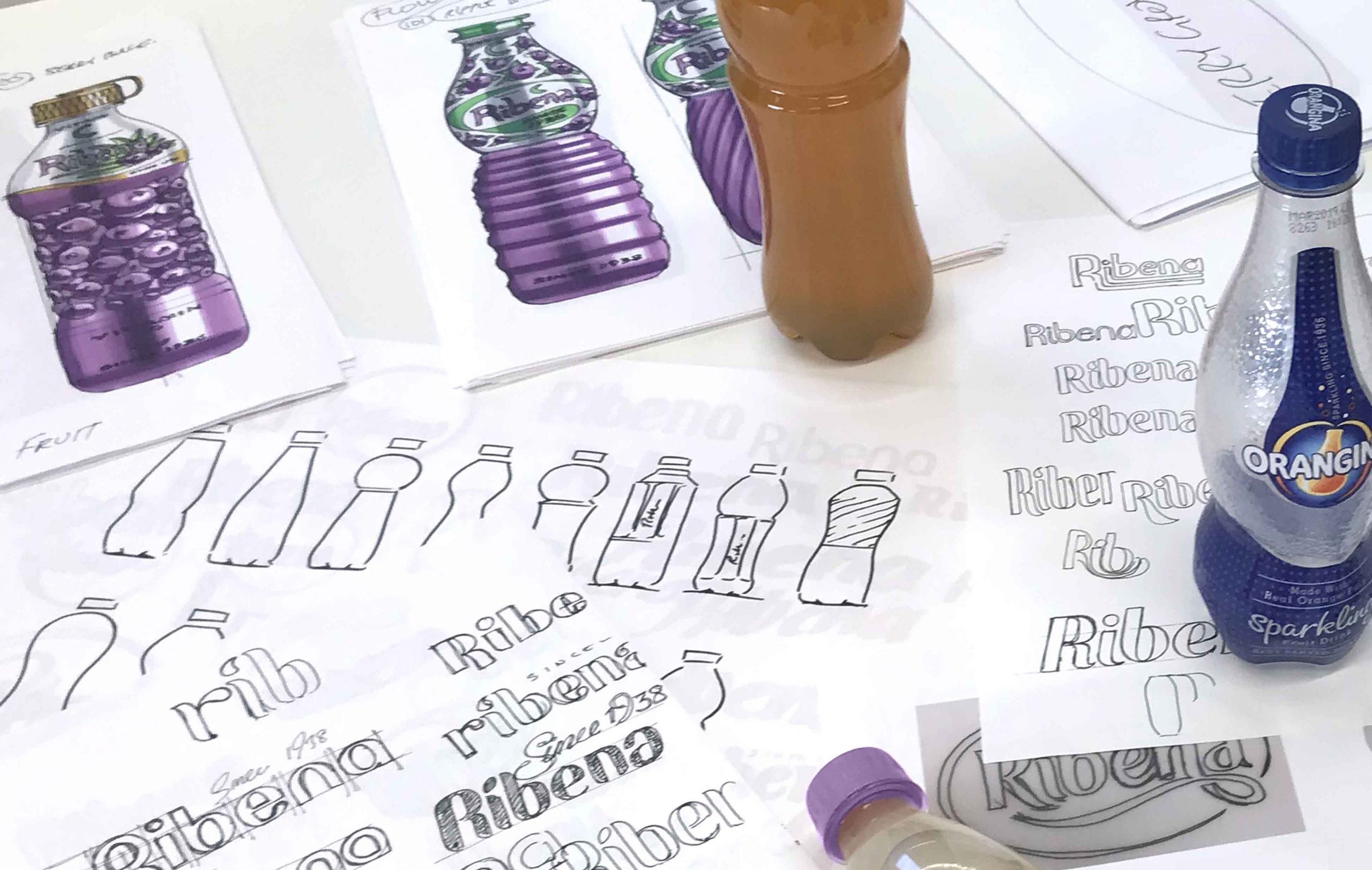
The next step was to begin visualising what this new product could look like, and the messages it should convey to the consumer. Central to this process was close collaboration between both the product design and brand teams within Seymourpowell, ensuring that each element of the design married seamlessly together. A key consideration for both teams, for instance, was how the bottle’s ergonomics would impact the user experience and the placement of brand messaging further down the line.

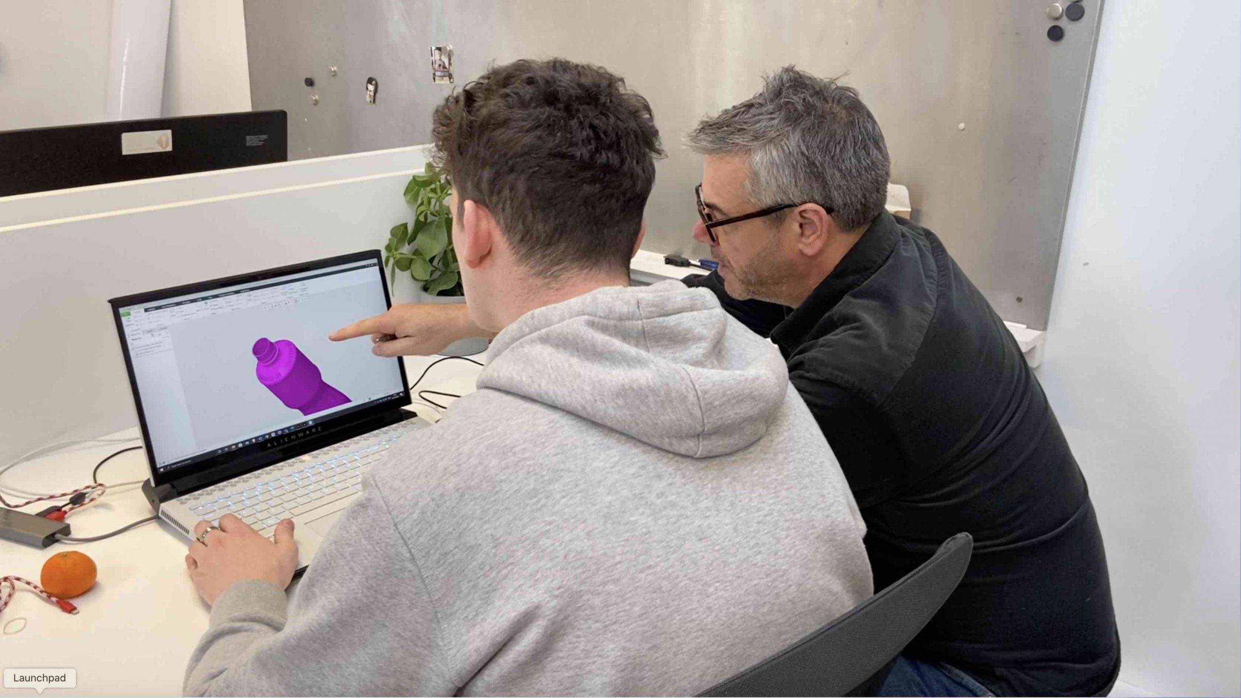
From here, it was all about refinement. Our rapid in-house prototyping capabilities enabled both our designers and the client to touch and feel proposed product changes in real-time, as we explored the possibilities at hand. Once we reached a point where the designs felt right, we entered the development phase, handing over our designs to Ribena’s in-house team of engineers and developers to bring them to life. This process was applied to both the Ready To Drink product and to the broader portfolio of 2D label redesigns.
The Outcomes
Based on our research, the Ready To Drink bottle’s physical shape has been modernised to appeal to an ever more sophisticated market and audience, whilst maintaining heritage elements. The new design evokes the idea of cut glass, adding greater elegance to the product and broadening its appeal.
Central to the success of the new design is the enhancement of the bottle’s recyclability. To combat historic bottle recognition issues encountered in recycling plants, Ribena had already made a commitment to reduce the bottle’s full shrink sleeve by over 50 percent before they approached us. As a result, a core challenge from a branding perspective was to utilise this reduced label space intelligently in order to deliver a compelling brand message and standout shelf presence.
To do so, natural cues were enhanced to promote the fruity taste of the juice by introducing illustrations of fruit nestled around the Ribena brandmark, whilst the new transparent, compact label allows the colour of the liquid inside to shine through. Ribena’s heritage identity has also been amplified in the redesign, with the company’s “Estd. 1938” message elevated to the top of the brand mark to provide a quality seal. In addition, a green leaf mark calls out the bottle’s sustainable properties, whilst the embossed “recycle me” message on the bottle’s neck serves as a call to action for consumers.

At Seymourpowell we often observe a natural thread from customer behaviour to final decision making. In our initial usability studies of the product we observed that the call to action was best placed directly in the customers’ eyeline as they were finishing the bottle. This finding enabled us to legitimately free up prized real estate on the label, instead placing the “recycle me” message on the bottle’s neck and driving greater customer awareness of the bottle’s recyclable properties.
The Portfolio
We then used what we had learned from our initial research on the Ribena brand to inform how we approached the 2D graphical redesigns for the additional three product ranges – each of which presents a unique offering for a specific demographic and occasion.
Throughout the design process for the Ready To Drink product, and the broader portfolio, it was important that a commonality was maintained. While each product possesses a uniqueness to it, it was also important that all designs still felt visually part of the recognisable Ribena family. That way, no matter how different the bottle or label, customers will still be able to associate this brand revolution with the drinks brand we all know, love and respect as a piece of British heritage.
To best present our thinking and strategize the approach, we used visual mapping techniques and mood boards to visualise what we wanted this fresh brand personality to look like. These helped us to create and incorporate a visual tonality throughout the 2D designs and ensure a common thread was presented across the portfolio, without compromising on each product’s unique offering.
The Core Squash product represents one of the most iconic products in the Ribena range. As such, the pack has been redesigned to magnify the rich and juicy flavours bursting within each bottle and to further enhance the proposition of the original Ribena drink. The bold background reflects the fruity and impactful taste, while the percentage of real fruit juice has been elevated to the top of the pack to highlight what makes Ribena Squash such a deliciously fruity soft drink.

Lower in calories and sugar, the No Added Sugar range represents a lighter offering to the wider range. We sought to celebrate its ‘light’ nature with a sky-blue brandmark set on a watercolour background. This reflects the moment where the squash and water combine to form a light and refreshing beverage. Present throughout these three products, and the Ready To Drink product as well, is the sense of natural fruit, provided by a premium British brand.
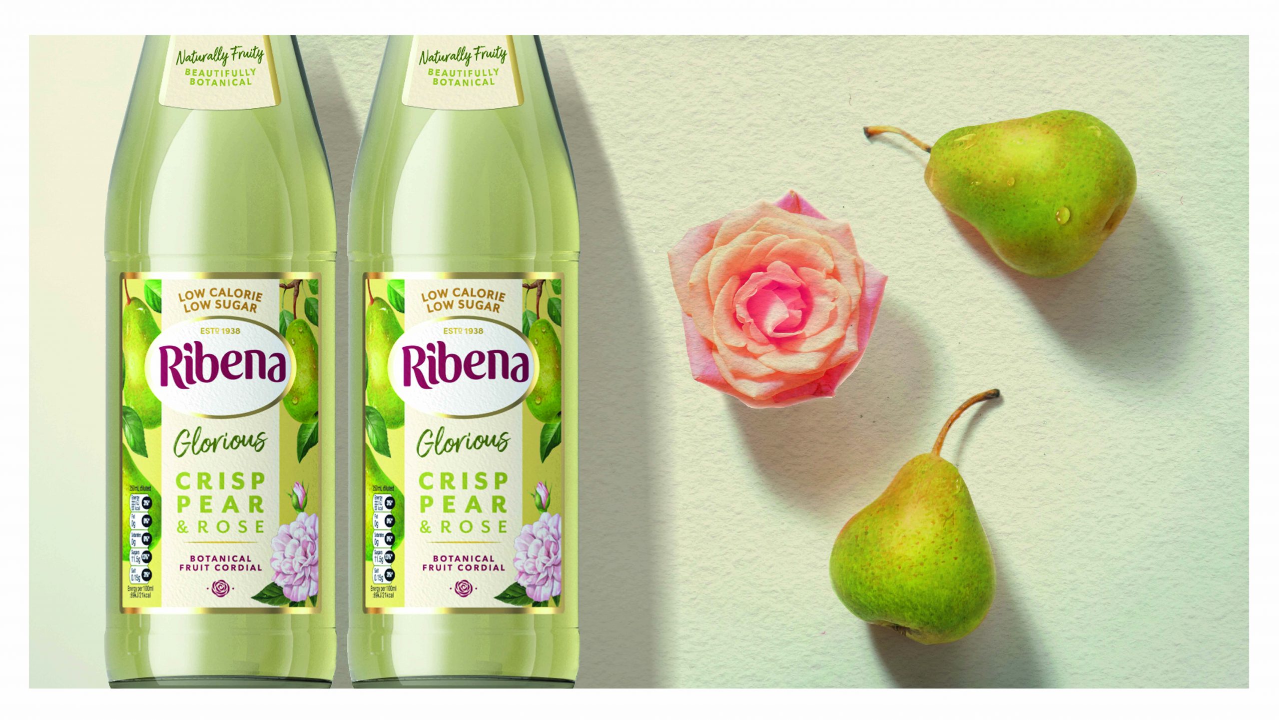
For the Botanical Fruit Cordial, we opted for a softer colour palette and textured paper for the label featuring illustrations of fruit and botanicals to provide lighter and more natural cues for the consumer. The gold accents elevate the occasion, suggesting the premium offering of this drinking experience, and the label highlights the unique flavour pairings of each drink.

Our collaboration with Ribena is one that we at Seymourpowell are immensely proud of and are thrilled to have been able to deliver. It is a partnership which has resulted in successful design; realising a brief which demanded brand elevation and modernisation, whilst preserving a heritage reputation and delivering on a sustainable promise.
Client Quote:
Charlotte Flook, Head of Ribena, Suntory Beverage and Food GB&I: “This launch is one of the most significant in our 80-year history as we look to tap into new and growing audiences and create ever-more sustainable packaging using a refreshed portfolio of drinks to do so. Our creative partners, Seymourpowell, worked tirelessly with us to uncover what our brand really means to these audiences, and how we can step forward into a new era for Ribena. This is one of the biggest challenges the brand has undertaken and we are incredibly proud to begin showcasing the results this year and next.”


