

Ben Brears takes us behind the scenes as his team, at Robot Food, embarked on a painstaking 12 month, global redesign of iconic Danish beer brand Tuborg
Tackling a product like Tuborg isn’t easy: in its homeland of Denmark, it’s so much more than just a beer brand – it’s a cultural icon. So we had to tread carefully with our brand refresh: unify and strengthen the brand world, while maintaining that sense of heritage.
That historical design approach led us to look into the archives to ‘deconstruct’ Tuborg’s designs. We looked at all the design elements, from shapes to colours, fonts, placement of design elements, and the architecture of individual labels to boil everything down to a suite of iconic assets that we could use to create an enduring new design system.
Creating community
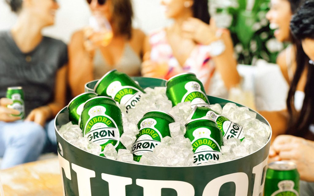
We took the idea of “fællesskab” – or community – as the starting point for our creative development. Community is a vital part of Danish culture, and so it was especially pertinent in the wake of Covid-enforced isolation. It therefore felt natural for the biggest beer brand in the country to leverage its role in bringing people together, especially as its portfolio offers a beer for every occasion.
As such a prevalent brand, taking niche approaches to targeting specific groups wouldn’t wash. It was about finding common ground and excluding nobody; putting people and togetherness at the centre of the brand experience.
But if Tuborg as a brand represented the idea of community, its previous pack designs didn’t reflect that. In fact, they were totally disconnected from one another. We had to unite the brand architecture to create a clear ‘community’ of beers – each with individual characteristics but all held under one collective, more uniform style.
The idea of centring the brand around people is brought to life in the brand world executions, which are based around a creative idea we dubbed “in the action”. Reportage-style photography with an unfiltered, spontaneous aesthetic celebrates togetherness in a way that feels uniquely Tuborg – and which places the consumer at the heart of the moment.
Celebrating the ‘Clockman’
Our refreshed designs look to emphasise Tuborg as a proud parent brand, harmonising the primary packaging around the brand’s ‘Clockman’ device – a well-known icon in Denmark.
The Clockman refers to the oval shape on the packs, which has been used extensively across the brand’s history. In Danish, it’s referred to as the ‘Urmager’ – which literally translates as the ‘Watchmaker’ – denoting its resemblance to a watch (or clock) face.
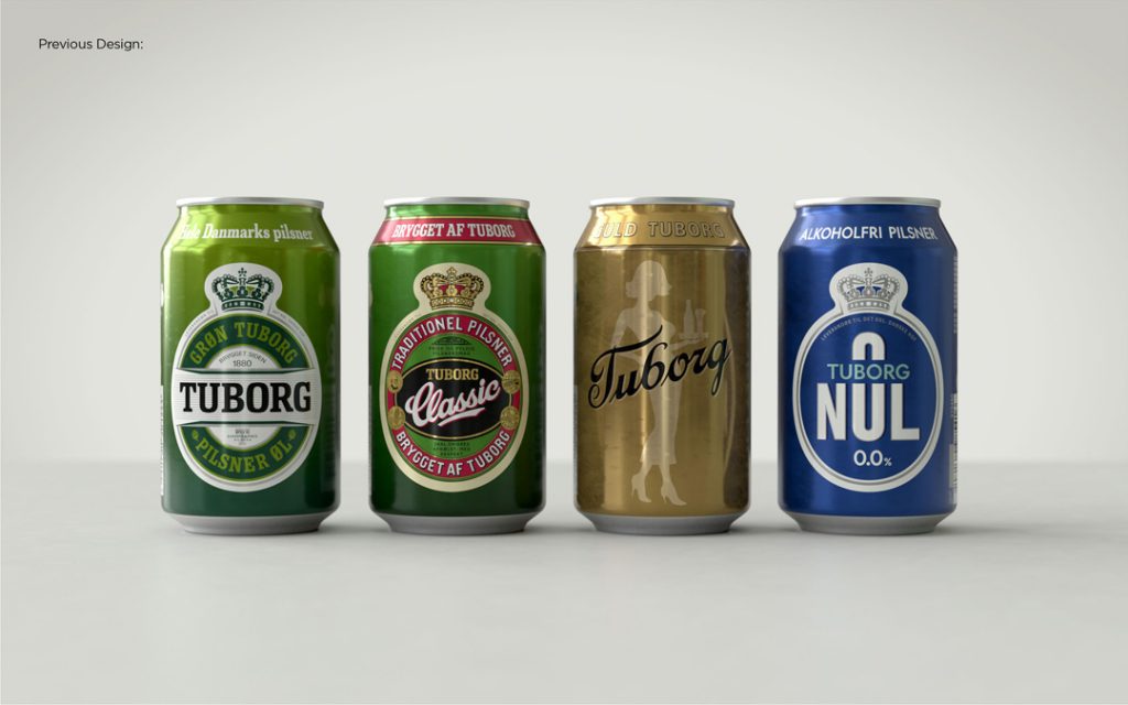
Amplifying that asset aligned with our overall strategy of looking at Tuborg’s rich heritage through its visual equity and assets, which have cemented its longstanding place in the hearts and minds of Danes. The Clockman has featured on Tuborg’s hero products Grøn and Classic for pretty much the entirety of their existence; and as such a well-known symbol, it made sense to expand its use.
Off-pack we united the Tuborg wordmark with the Clockman for the first time, helping build a bridge between on- and off-pack worlds, strengthening brand recognition, and underscoring the sense of ‘Fællesskab’ across all touchpoints.
Nods to history
The design work was framed around building on the brand’s existing equity, so the majority of type and colour decisions are informed by the brand’s rich history. We looked to create an evolution, rather than a revolution for the sake of it, which might feel jarring to existing audiences that trusted in the brand’s heritage.
We introduced a redrawn Tuborg wordmark for the packaging, created with assistance from typographer Rob Clarke, which sits proudly on the curve at the top of each pack.
The Tuborg Grøn (green in English) variant bears some of the most significant changes to the design. It now uses a brighter, more refreshing colour palette to ensure it stands out on shelf and at the bar, but also to make the beer really live up to its “Green” name. We also created a nod back to the brand’s history with a new Grøn wordmark (also created with Rob Clarke) that mimics the typography on Tuborg’s historic Copenhagen brewery building.
Not just for dads
One of the biggest challenges in refreshing the brand to appeal to new audiences was one shared by most beer brands today: addressing the changes in consumer behaviour, particularly with younger audiences.
There’s been much chatter about how Gen Z in particular are either drinking less, not drinking at all, or looking at alternatives to beer. Globally, it’s said that among drinkers aged 18-25 there’s a more ‘all or nothing’ mentality, rather than the ‘little and often’ approach of older generations.
Tuborg, like other brands, was losing favour with that demographic. Drinking the beer your dad drinks can feel like the antithesis of cool. But since that generation values immediacy and accessibility, by simplifying everything across the brand – removing obstacles by doing away with clutter, complexity, inconsistency, and confusion – the broader pillars of the refresh would hopefully naturally chime with younger consumers. We then had to press the repeat button on what people were seeing and reading, to steadily reinforce the same visual and verbal assets.
Building relevance
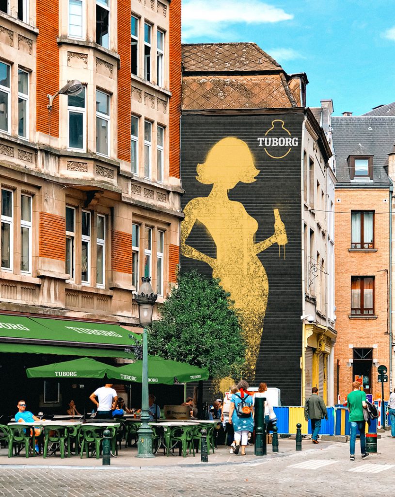
Tuborg Guld has always had a different role to play in the portfolio: it’s an easy drinking but stronger brew for more high-energy moments – a beer to ‘get the party started’. It already over-indexed with younger drinkers, and particularly women, so it was helping the brand move in the right direction – towards relevance today.
Our job was to turn the volume up on what Guld was already doing: to modernise it and make it feel less like an outlier, without pushing too hard to make it something it wasn’t.
The ‘Golden Lady’ illustration on pack had remained unchanged for 30 years. We had to realign the illustration to be more representative of the values of current drinkers, so we worked on a number of different iterations from more abstract styles to treatments closer to the former iconic silhouette. Consumers ultimately guided us towards the subtle shift we landed on. Where the Golden Lady was previously serving the beers on a tray, now she’s at the party, drinking one herself.
Personality-packed beers for the people
Tuborg has a broad portfolio of brews – they aren’t a one-trick pony – and those different beers cater to different people, different tastes, and different occasions.
For us, this meant amplifying what makes Tuborg great; enhancing the individual personalities of its beers on- and off-pack to ensure their relevance for all consumers, then visually uniting and strengthening them around a prouder parent brand.
There’s a sense of classicism in Denmark’s approach to design: if you look at the fundamentals of things like furniture, the style and aesthetic doesn’t really change much over time. It’s about simplicity – doing things properly and to the best of your ability to create something that’s built for the long term, rather than looking to something “fast-fashion” or defaulting to the zeitgeist for the sake of it.
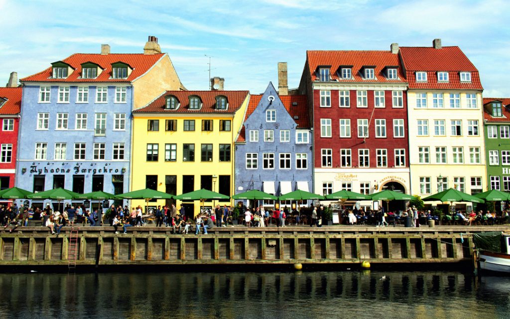
Tuborg has always been integrated into Danish culture: without Danes, there is no Tuborg! Our work was about continuing that tradition – making Tuborg relevant for all Danes today in a way that would chime with its legacy.
