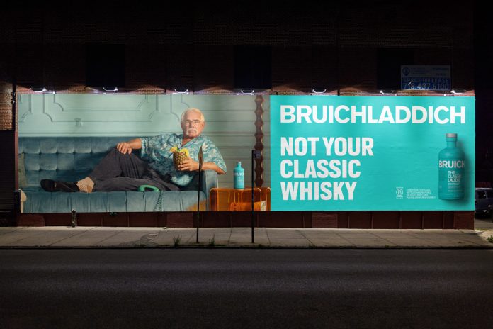
Matt Burns discusses his team’s latest campaign work with Bruichladdich who continue to shake-up category conventions in whisky
Countless brands claim to be boundary pushing, but few are ambitious enough to consistently defy convention, especially in whisky, where a serious attitude pervades.
True, we’re seeing impressive innovations in packaging design, largely driven by beverage sector-wide sustainability goals of net zero emissions by 2030 and 2050. Diageo’s work on whisky’s lightest ever bottle for Johnnie Walker Blue Label is a trailblazing case in point. Moves towards lightweighting packaging are having the most noticeable impact in the premium tier of spirits, where we’re seeing a stripping back and a reduction of the weighty, elaborate materials traditionally relied on to convey prestige.
But in terms of disruptive, through the line branding that defies whisky’s conservative norms to drive growth and innovation? For a brand willing to challenge the status quo, the stage is set.
Enter Bruichladdich. Since day one, the B Corp certified Scotch whisky distillery has consistently set out to be pioneers and changemakers, intent on proving that whisky can be a force for good. Their secret sauce? Knowing their brand DNA. Every new layer we reveal for Bruichladdich is vastly different to the last, but it’s always interconnected – rooted in their brand mission of progress, drop by drop.
Making people smile in the whisky aisle
And now, the creative thinking behind the launch of the ‘Not Your Classic’ campaign follows this irreverent vein, adding a new chapter to Bruichladdich’s outside-the-box approach to brand while staying very much true to its progressive, playful DNA.
It started with an observation: when’s the last time you saw someone smile in the whisky aisle? Yeah, us too. We wanted to change that with Bruichladdich and finally quash the idea that ‘premium’ and ‘heritage’ must mean ‘serious’.

Playfulness and quality can and do coexist
That drive for positive but meaningful change is at the heart of our latest campaign for Bruichladdich’s flagship single malt whisky, The Classic Laddie, named ‘Not Your Classic’.
Historically, the whisky world has seemed synonymous with Monarch of the Glen-esque style rolling highlands, misty moors, stately stags; equally stately gentleman swirling brown liquid in a heavy crystal tumbler.
There’s not been a lot of humanity and warmth to be found in the sector’s typically ‘boots and britches, retiring to the drawing room’ past; but we felt that Bruichladdich is superbly placed to unlock the emotion of whisky, and inject some fun and personality into the category.
Basically, with Bruichladdich, we’re on a mission to demonstrate to the industry that there’s a bolder, more enjoyable way this whisky can behave when we step away from category norms to celebrate unconventionality.
Cutting through the noise
Always the irreverent player in the category, Bruichladdich has long educated the industry and consumers alike on how whisky can be produced. Every time we launch a new project for them at Thirst, we dial up a new facet of the brand story. It’s about bringing new meaning each time, so we keep entertaining existing fans of the brand but also constantly recruit new ones.
The central idea for ‘Not Your Classic’ is that while the product may be called ‘The Classic Laddie’, there’s nothing classic in the way Bruichladdich looks or how it behaves.

That’s obvious in the product’s distinctive appearance: its bottle stands out for its bright turquoise; and encompasses its forward-thinking attitude. It’s a light, bright and unexpected counterpoint to the rows of beige liquids the whisky aisle usually comprises: Bruichladdich stands out in its highly distinctive packaging design, and that feeling had to carry through in the campaign, too.
We started with the insight that consumers seeking out conscientious brands don’t just want to hear about sustainability and social responsibility. Bruichladdich wanted to cut through the relentless bad news cycle, bringing a much-needed smile and a laugh.
Speaking to whisky consumers in a way they’d never been spoken to before, a more playful, tongue-in-cheek tone of voice was a big part of this work.
A category in flux
We’ve undoubtedly seen some movements away from stiff conventions in the recent whisky renaissance. But for the most part, the category still often feels quite serious with purpose-led messages focused around things like gender stereotypes. We asked ourselves, “how can we offer a bolder, more playful and unexpected choice to whisky drinkers everywhere?”
As a certified B Corp, Bruichladdich prides itself on its positive, purpose-driven philosophy; all part of its holistic drive to challenge the conventions of the whisky industry. The distillery has a 32% lighter bottle, has reduced its carbon emissions by 65%, uses 60% recycled glass, and has dropped its outer box for lighter palletisation.
So, creating this campaign wasn’t just about thinking outside the box: it was about starting from a place where the box does not exist. Not Your Classic had to be an extension of the eye-catching bottles’ progressive, playful nature.

Where many whisky brands trade on a certain sense of exclusivity that can feel inaccessible for new audiences, Bruichladdich does quite the opposite: it’s about accessibility and delight. The new campaign imagery is based around three powerful ‘irreverent heroes’ – Outlook, Attitude and Thinking – each seeking to dispel the traditional notions associated with whisky.
We approached these by considering how they’d present if they were people. That resulted in a brilliantly eccentric cast of three characters that form the pillars of the campaign: an octogenarian at a roller disco, defying conventions with her youthful, confident energy and enigmatic charisma; a distinguished man reclining on a velvet couch, comfortable in his own skin as he sips whisky from a pineapple; a young woman savouring a dram with a book in the quiet of night. Each occupies a scene that challenges preconceptions of what a ‘typical’ whisky drinker looks like.

We didn’t build these profiles directly from research but rather through creative exploration of what would subvert traditional whisky drinker stereotypes, especially around women drinking neat whisky.
We also believe there’s so much more to the whisky story than age statement. It’s also about terroir, the soil, the barley, and the ecosystem. Age alone doesn’t define our spirit, and we’re rebelling against that category norm. Doing this also shifts the narrative away from the liquid and towards the consumer, making them the protagonists.
Layers of storytelling
The imagery was shot by renowned LA-based photographer Justin Bettman. His cinematic style, conceptual compositions, and flair for visual storytelling made his work perfect for bringing these three characters to life, while giving subtle visual nods to the central Bruichladdich brand with its characteristic aqua hues used throughout the imagery.
We briefed Justin to help us create the three worlds for these unusual characters and show the ways in which they experience moments of joy in unexpected ways, ultimately landing on a balance between quirky, relatable, and showcasing the manifold possibilities of what a whisky drinker can look like.
These scenes, like the campaign more broadly, are irreverent and tongue-in-cheek in many ways, but they underscore a very real message: that no one should feel intimidated by the whisky category, or that it ‘isn’t for them’ just because they don’t fit with a historically narrow, largely male dominated stereotype.
We want consumers to feel empowered to experiment with whisky in new and exciting ways that feel right for them. Including some hidden ‘Easter egg’ elements in the scenes further introduces Bruichladdich’s identity through fun, discoverable moments.
Always doing things differently
The entire ethos of the brand focuses on doing things no one else does. Like dropping the secondary pack: not only a more sustainable option, but a succinct way of showing the barley as a key part of the Bruichladdich flavour. We constantly aim to re-educate the consumer and the industry in a creative way.
Every touchpoint for ‘Not Your Classic’ also contributes to the creation of a world that subverts the status quo. That might be in our retail displays; subverting of holiday occasions like Thanksgiving, Christmas, Chinese New Year, Father’s Day, where we created the idea of a personalised bottle message in the “Not Your Classic Door” idea or activations like the “Not Your Classic” rides – a taxi service with a Bruichladdich interior.

The red thread through every activation is playing on Bruichladdich’s mission to make drinkers smile in the whisky aisle. It’s all about being progressive and fun, and celebrating difference.
Bruichladdich ultimately wants to be the most values-driven whisky brand in the world. While our work with them to date has shown that consistently, ‘Not Your Classic’ takes it even further. But we’re still just at the start of what we can do with Bruichladdich, and for the whisky category at large.
Matt Burns is the Executive Creative Director and co-founder at Thirst


